Understanding dark patterns restaurant technology and why ethical UX is becoming a competitive advantage and compliance requirement.
The tip screen defaults to 25%. The "No Tip" option is hidden behind "Custom Amount." The decline button is gray text on a gray background.
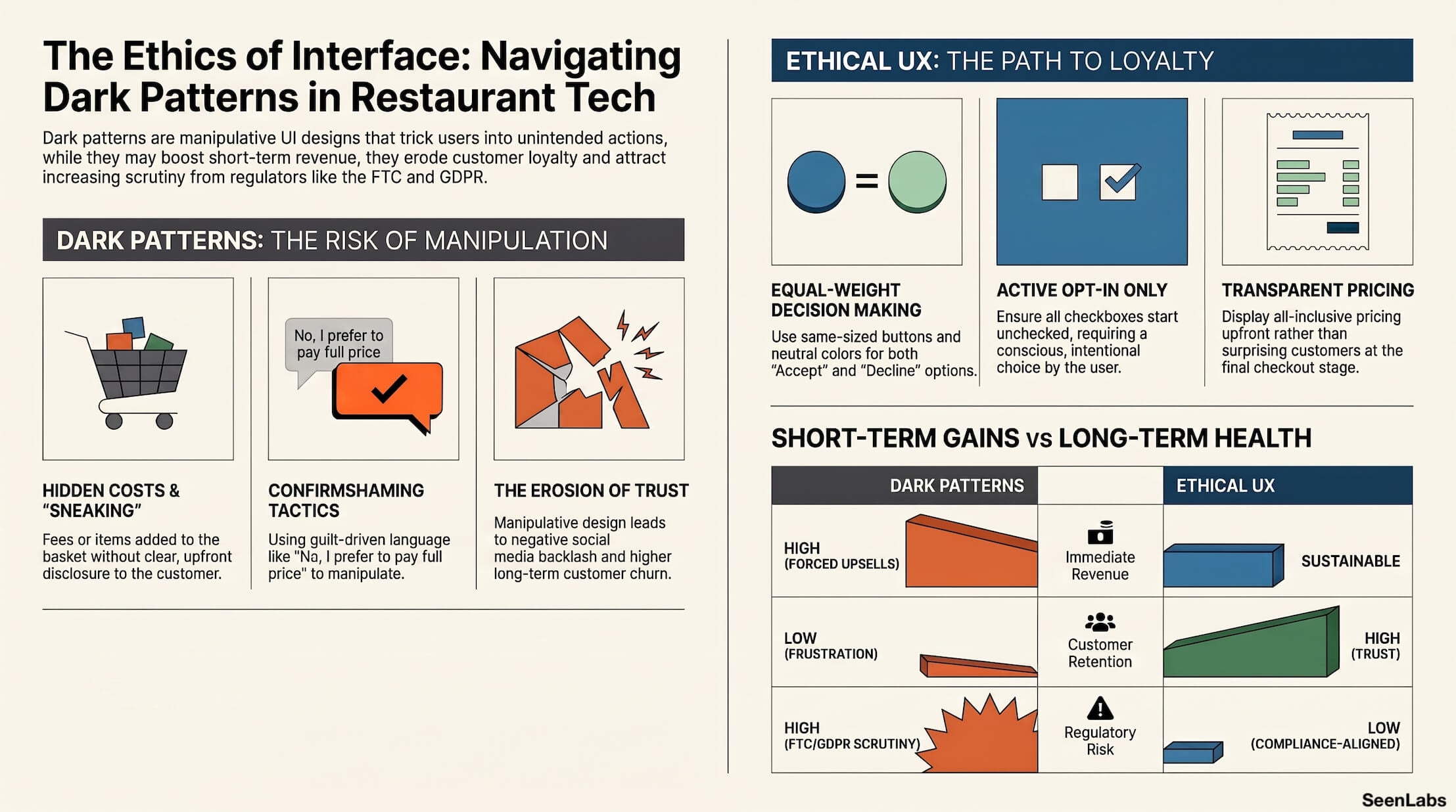
These aren't accidents. They're dark patterns—manipulative design techniques that trick users into actions they didn't intend. And they're increasingly common in restaurant technology.
From pre-selected meal upgrades to hidden fees and confusing checkout flows, dark patterns may boost short-term metrics while eroding customer trust and attracting regulatory scrutiny.
This article explains what dark patterns are, why they're problematic, and how operators can build ethical digital experiences that perform better in the long run.
What Are Dark Patterns?
Dark patterns are user interface designs that manipulate users into doing things they didn't mean to do—or wouldn't do if they fully understood the choice.
The term was coined by UX researcher Harry Brignull in 2010. Since then, regulators, academics, and consumer advocates have increasingly focused on these practices.
Key characteristics of dark patterns:
- Design choices that benefit the business at customer expense
- Exploitation of cognitive biases and habits
- Obscuring information customers need to make informed decisions
- Making unwanted actions easy and wanted actions hard
Types of Dark Patterns in QSR Technology
Dark patterns appear throughout restaurant digital experiences.
Trick Questions
Confusing phrasing that leads to unintended selections:
- "Uncheck this box if you don't want to not receive promotional emails"
- "Skip this step" appears to cancel, but actually confirms
- Yes/No buttons in unexpected positions
Why it's dark: Exploits reading habits and attention limits to secure consent that wasn't informed.
Sneak into Basket
Items added to orders without clear customer action:
- "Make it a Large" pre-checked by default
- Suggested add-ons automatically included
- Service fees appearing at checkout without earlier disclosure
Why it's dark: Customers pay for things they didn't actively choose. Many won't notice until after payment.
Roach Motel
Easy to get in, hard to get out:
Why it's dark: Traps customers in relationships or charges they'd exit if the process were fair.
Forced Continuity
Ongoing charges that start automatically and continue silently:
- "Free trial" that converts to subscription buried in terms
- App memberships enrolled during ordering flow
- Automatic reorder programs with confusing opt-out
Why it's dark: Charges continue after value or interest ends, exploiting inertia rather than preference.
Confirmshaming
Guilt-laden decline language:
- "No, I don't want to save money"
- "I prefer to pay full price"
- "Not now, I'll miss this deal"
Why it's dark: Uses emotional manipulation rather than value proposition. Customers who decline feel judged.
Hidden Costs
Fees that appear only at final checkout:
- "Service fee" added at payment
- "Packaging fee" disclosed after order completed
- Menu prices don't match checkout totals
Why it's dark: Customers commit to an order based on incomplete price information.
The Regulatory Landscape
Dark patterns are receiving increasing legal and regulatory attention.
FTC Scrutiny
The Federal Trade Commission has explicitly targeted dark patterns:
- 2021: FTC workshop on "Bringing Dark Patterns to Light"
- 2022: Enforcement actions against companies using dark patterns
- Ongoing: Updated guidance on "negative option" practices (automatic renewals)
The FTC can pursue dark patterns as unfair or deceptive trade practices under Section 5 of the FTC Act.
State Consumer Protection Laws
Several states have enacted or proposed dark pattern legislation:
- California (CPRA): Specific requirements for opt-out mechanisms
- Colorado and other CCPA-like states: Similar provisions emerging
- General consumer protection laws increasingly interpreted to cover digital manipulation
GDPR Implications
For international operations, GDPR in Europe has been interpreted to prohibit dark patterns in consent collection. The "freely given, specific, informed, and unambiguous" consent standard is difficult to meet with manipulative design.
The Direction Is Clear
Regulatory pressure on dark patterns is increasing, not decreasing. Practices that are legal today may face enforcement tomorrow. Building ethical UX now is both values-aligned and risk-reducing.
The Trust Erosion Effect
Beyond compliance, dark patterns damage business fundamentals.
Short-Term vs. Long-Term Revenue
Dark patterns may boost immediate metrics:
- Higher upsell rates
- More loyalty sign-ups
- Larger average tips
But they create long-term costs:
- Reduced repeat visits from frustrated customers
- Negative reviews and social media complaints
- Staff time handling complaints and refunds
- Regulatory risk and potential enforcement costs
Customer Loyalty Impact
Customers who feel manipulated don't become loyal:
- They use your location because it's convenient, not preferred
- They're vulnerable to competitor offers
- They won't recommend you to others
- They'll leave when a better option appears
Trust, once broken, is expensive to rebuild.
Social Media Backlash
Manipulative experiences generate viral complaints:
- Screenshots of confusing interfaces
- Videos of frustrating checkout flows
- Threads documenting deceptive practices
One viral post can reach millions. The reputational cost far exceeds any transaction-level gains.
Employee Frustration
Staff members handle the complaints:
- "I didn't order that upgrade"
- "Why is my bill higher than the menu price?"
- "How do I cancel this subscription?"
Dark patterns create frontline burden and morale impact.
Ethical Design Alternatives
Every dark pattern has an ethical alternative that still serves business goals.
Clear, Honest Language
Instead of: "No, I don't want to save money" Use: "No thanks" or "Skip"
Instead of: Confusing double negatives Use: Simple, direct statements
Equal-Weight Accept/Decline
Instead of: Large green "Accept" / tiny gray "Decline" Use: Same-sized buttons with neutral colors
Instead of: Accept button only, with hidden dismiss Use: Visible, accessible alternatives
Pre-selection = Opt-In Only
Instead of: Checkboxes pre-checked Use: All options start unchecked
Instead of: Automatic upsizes or additions Use: Clear offers that require active selection
Easy Modification and Cancellation
Instead of: Complex multi-step removal Use: Remove as easy as add
Instead of: Hidden unsubscribe Use: Clear, accessible opt-out in same location as opt-in
Transparent Pricing Always Visible
Instead of: Fees appearing at checkout Use: All-inclusive pricing displayed upfront
Instead of: "Starting at" prices with hidden additions Use: Actual prices for standard configuration
How to Audit Your Current UX
Evaluate your digital experiences for dark patterns.
Dark Pattern Checklist
Review each digital touchpoint (kiosk, app, website):
- [ ] Are any options pre-selected?
- [ ] Are accept/decline buttons equally visible and accessible?
- [ ] Is pricing consistent from menu through checkout?
- [ ] Can customers easily remove items or cancel selections?
- [ ] Is language clear and non-manipulative?
- [ ] Are fees disclosed before the checkout stage?
- [ ] Can subscriptions/memberships be canceled as easily as enrolled?
Third-Party UX Review
Consider external evaluation:
- Fresh eyes catch patterns internal teams accept as normal
- UX professionals can identify manipulation you didn't intend
- Customer research reveals perception gaps
Customer Feedback Analysis
Review complaints for patterns:
- "I didn't mean to order that"
- "The charges were higher than expected"
- "I couldn't figure out how to cancel"
These signals indicate dark pattern problems even if unintentional.
How SeenLabs Contributes
Dark patterns occur primarily in kiosk ordering software, not CMS. SeenLabs contributes through:
Industry Expertise Educating operators on ethical UX standards and helping identify problematic patterns in existing systems.
Vendor Evaluation Guidance Helping select kiosk and ordering solutions with ethical UX practices built in.
Content Best Practices Ensuring digital menu and signage content is transparent and honest, complementing ethical ordering experiences.
Regulatory Awareness Staying current on FTC guidance and consumer protection trends to help operators stay compliant.
Conclusion: Trust Is a Competitive Advantage
In a market where technology experiences are increasingly similar, ethical UX becomes differentiation.
Key Takeaways
1. Dark patterns are increasingly regulated — What's tolerated today may be enforced tomorrow
2. Short-term gains create long-term costs — Trust erosion, complaints, and churn
3. Every dark pattern has an ethical alternative — Business goals can be met honestly
4. Audit your current experience — Patterns may exist that weren't intentionally designed
5. Ethical UX drives loyalty — Customers reward brands they trust
The restaurant that respects its customers' time, attention, and intelligence earns their repeat business. The restaurant that manipulates them earns their departure.
Ready to Build More Trustworthy Digital Experiences?
About SeenLabs
SeenLabs builds digital signage solutions with transparency and customer respect at the core. We help operators create experiences that earn trust rather than exploit it.